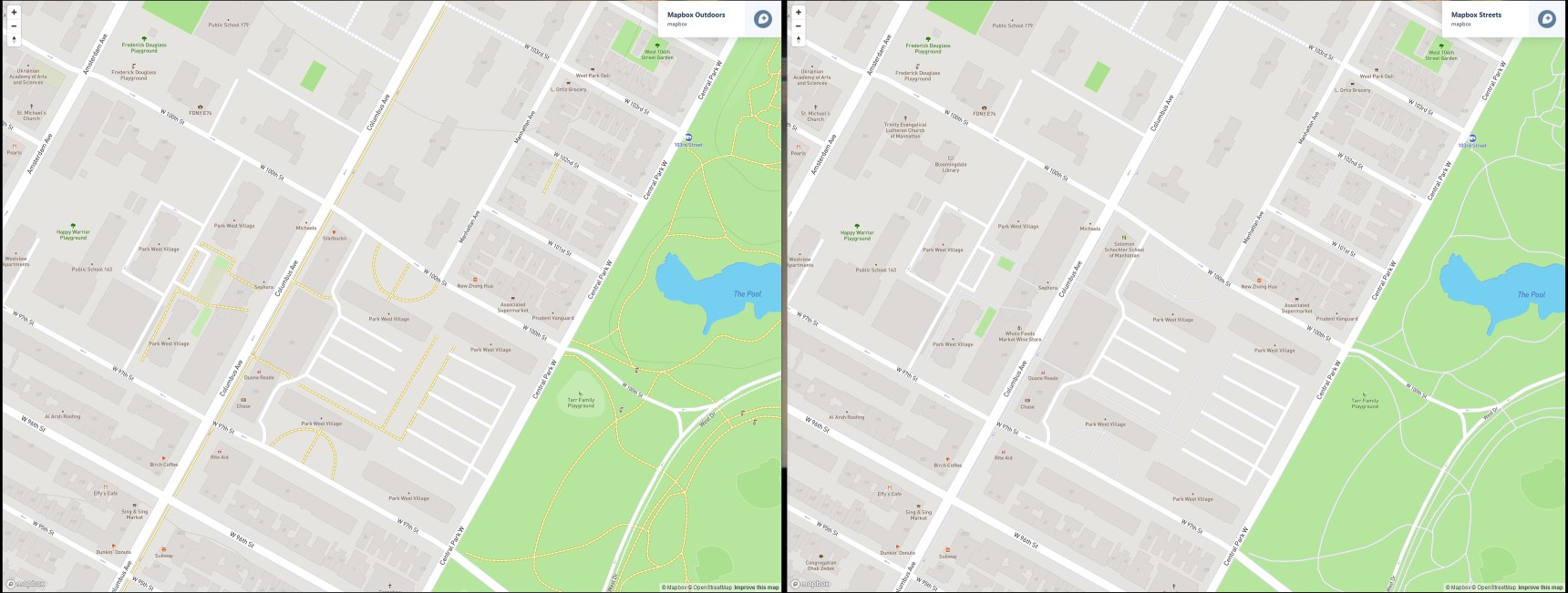
I updated the underlying map style to a slightly customized version of Mapbox Streets style.
The changes remove some labels for buildings, points of interest, highways, exits, and stuff. It also “flattens” the image by not including terrain details.
My intention was to make the map less “busy”, with a focus on the street names.
It doesn’t change much, but I’d like feedback if it affected your use of CityStrides.
When I select the globe button, though, the life map traces disappear and it does not switch to satellite, it just goes to a street map with no purple lines. Clicking the globe button again does not change anything and the page needs to be re-loaded to show anything but a blank street map
@hjkiddk I reworked the paths to be a long dot instead of a short one, this makes them a bit more prominent. I also changed the color from a grey to the white that streets use.
Mapbox says that these design changes can take a bit to show up, because of caching. I’d like to know if this is enough, or if there needs to be further distinction. Here’s a screenshot in the meantime:
I personally didn’t mind having some poi and other stuff in there, but I get your rationale for removing them. Would it be possible to bring public transport back in though? It would be nice to have at least subway and light rail stations on the map as I use these as starting points for planning/completing new areas.
No, that should go in its own post in #ideas
(If you add that, can you describe the request a bit more? I want to be sure I understand what you’re asking for.)
I know this isn’t necessarily a priority at the moment, but we’ve had the new map style for over a month now so I thought it might be good to have a quick feedback round.
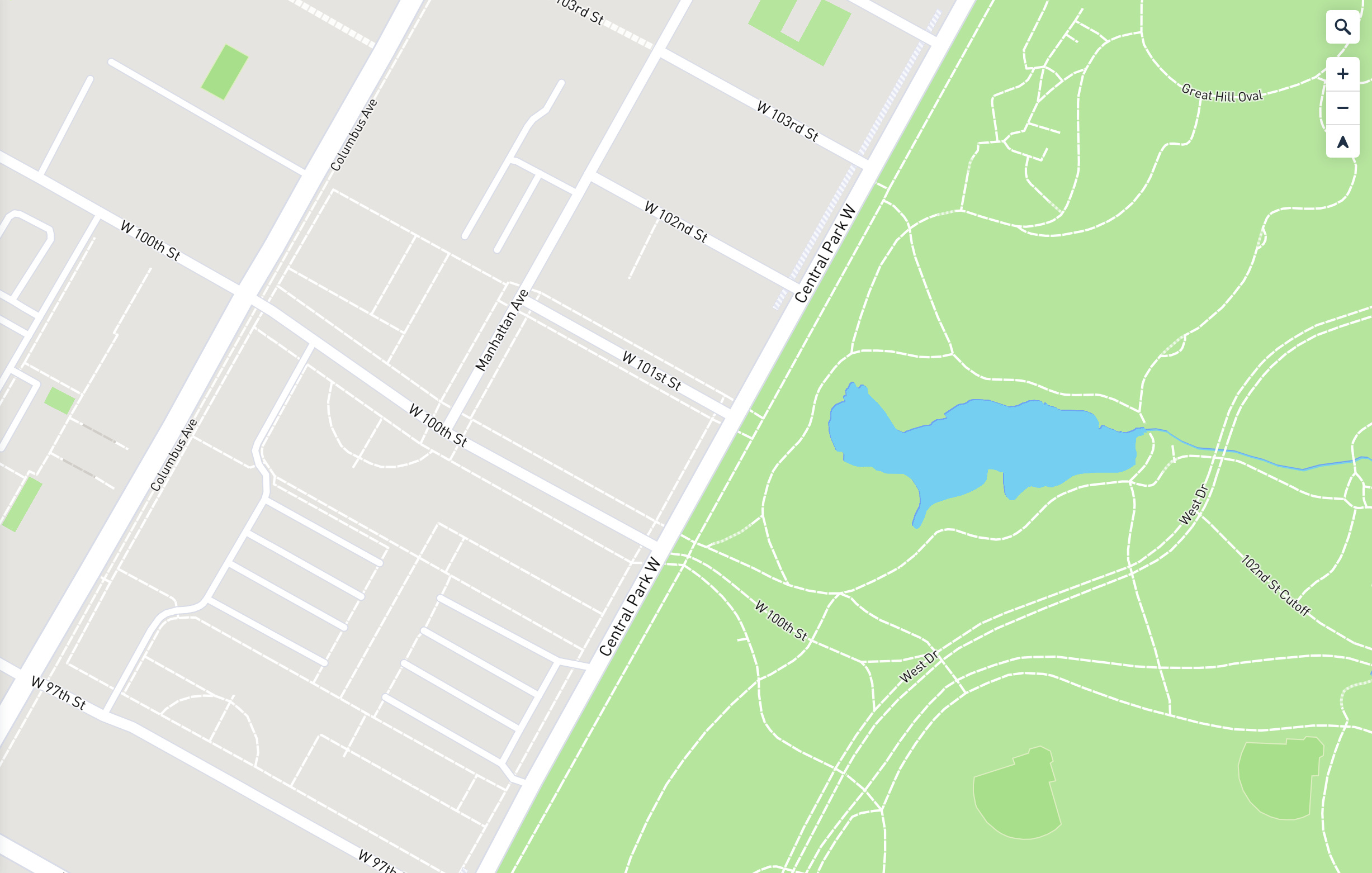
My view is that the updated style is too minimalistic. While it’s true that POI and the other text add some degree of visual clutter they also give a lot of context. The streets are important of course, but the landmarks are schools, parks, ponds, cemeteries, etc. Without them it’s just generic green areas, parking lots in random places and generally difficult to get a feel for an area before actually going there. I find myself using the satellite view more, since that keeps the “old” style.
I like the minimalistic view, escpecially on my phone.
When planning route on PC it might be nice with some more info, but right now it seems to work fine.
So no need to change anything if you ask me.