I love Citystrides and happily subsribe but I seriously do not like the new look. The colors are too dull, the street names don’t appear unless you zoom in closely, there’s no satellite option (I use this heavily while in NYC and elsewhere to see what’s around and what’s nearby because the map option simply blocks off space without indicating why the space is blocked off, which doesn’t tell me if I really need to go around or I can go through it, like a park or a parking lot, and if there’s gates or fences), when street names do appear if I zoom in the names appear very slowly and don’t give as much detail (ie fewer street names) than the Mapbox version and what it does show it is very difficult to tell if what’s being shown are streets or something else.
I could care less about political boundaries. I want to see where I need to go and what I’ve done with clear nodes, clear indications of where the street starts and ends and how I can complete the street. For those of us with older eyes, the colors of white and grey make it very hard to read.
Please bring back the other map. As a paid subscriber, maybe stop letting so many people enjoy your website for free to pay for the higher price.
Seems to be a bit better but yesterday but it is rather annoying to pay for a service that suddenly cuts out satellite maps and makes an attempt to make the base maps sort of as clear as they were but still falls a bit short.
Also have the red dots changed?
The “white” roads seem less white than they were. We seem to have a lot of clutter still - things like sidewalks on residential roads which seems somebody was over keen on OSM but adds nothing really for me when doing “streets” as I always find it easier to run in the road if safe to do so which it usually is on quiet residential roads.
This a good example of why we need satellite maps. This is a new road which when visiting not long ago was “half built” and I altered OSM to make the unfinished bits “proposed”. Looks like somebody might have reinstated them but they are built? As it stands the nodes look like random ones in a field so I would at the satellite map to check if they are least outlined.
Also in general terms I see something unusual on my Life Map and/or “to do” and think what’s that? Usually you get a far better idea looking at the satellite view.
Other times satellite view just gets a real for a location. Is it a maze of tortuous dead ends or something more interesting. Does there look to be many cars visible to see if going to be pleasant or potentially otherwise.
My reasoning that sidewalks and parking aisles need to be removed. I will map out fairly complex runs and export the GPX and import to RunGo for audible turn by turn instruction. With sidewalks, I need to be super careful to be sure to map the road and not the constant in/out from road to sidewalk otherwise the turn by turn gets a bit screwy.
Political is OK, but my opinion… not needed, it is NBD if your “over” a border. You should know approximately where you are anyway and you’ll need that road across the border someday in the future.
I’ve been mapping for 3 decades… you’ll need that road in a few years
This feedback is very interesting at this point in my restyling efforts. I’ve gotten things very close to how they were before, but it sounds like I’m missing some details.
I can’t put my finger on how the new style is duller than the old style.
Yeah, these are still lingering issues.
I’ve been improving the street name visibility bit by bit, but I agree that it’s not there yet.
I’m figuring out what my path forward will be for the satellite view, since this provider doesn’t offer that.
They have. I was using a sprite shape, but realized I can use a circle instead. I think one person in this thread requested that the outline be removed - I forgot to include that in my last release, so that’ll be in the next one.
They’re not. They are exactly as #fff in this style as they were in the old one.
The path layer was still a vibrant white, which made it stand out a bit more. The latest version decreases the opacity of those, to more closely align with the old style. This is not reflected in my screenshot but is in the live site right now.
I’m not arguing against satellite maps. My interest is as simple as “show of hands who uses satellite maps”, and I’ve heard enough feedback here to place satellite view in the list of required features.
This has more or less nothing to do with what’s displayed on the map. The routing service has its own OSM data, and I instruct it to use walking directions, so it’s entirely possible that the service produces a route that goes on/off sidewalks regardless of whether or not those sidewalks are displayed on the map. I’ve seen this happen, and you can usually spot the little shifts in the blue dotted line - if you notice them, you can undo your last click & click on the actual road a little further in from where the service pushed you out into a sidewalk. It kind of forces the service to route you over the street, instead of ducking in and out of sidewalks etc.
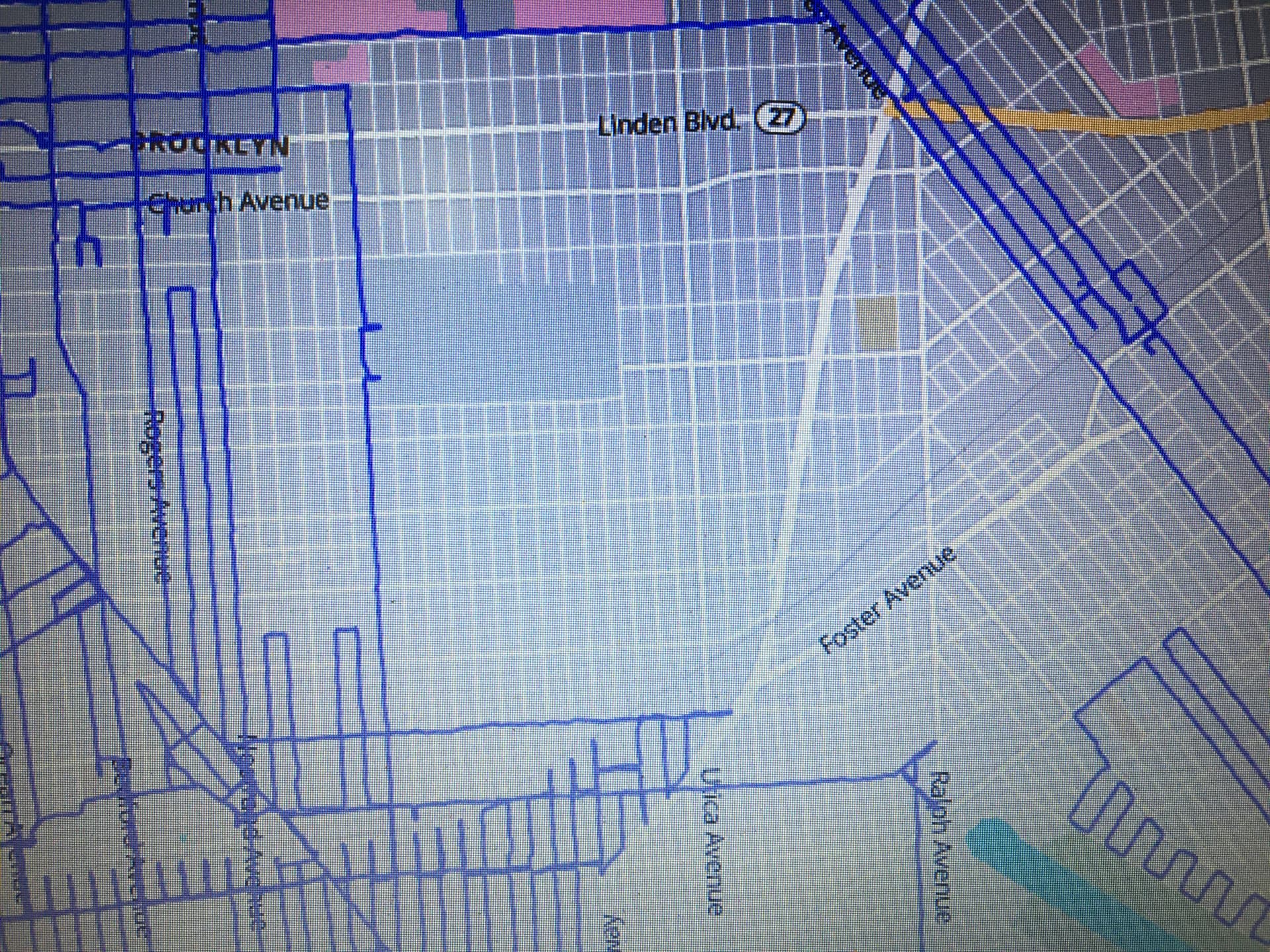
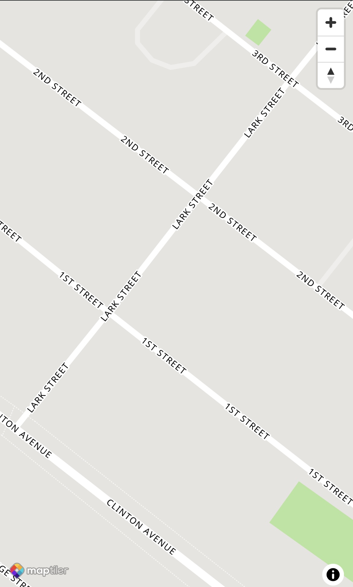
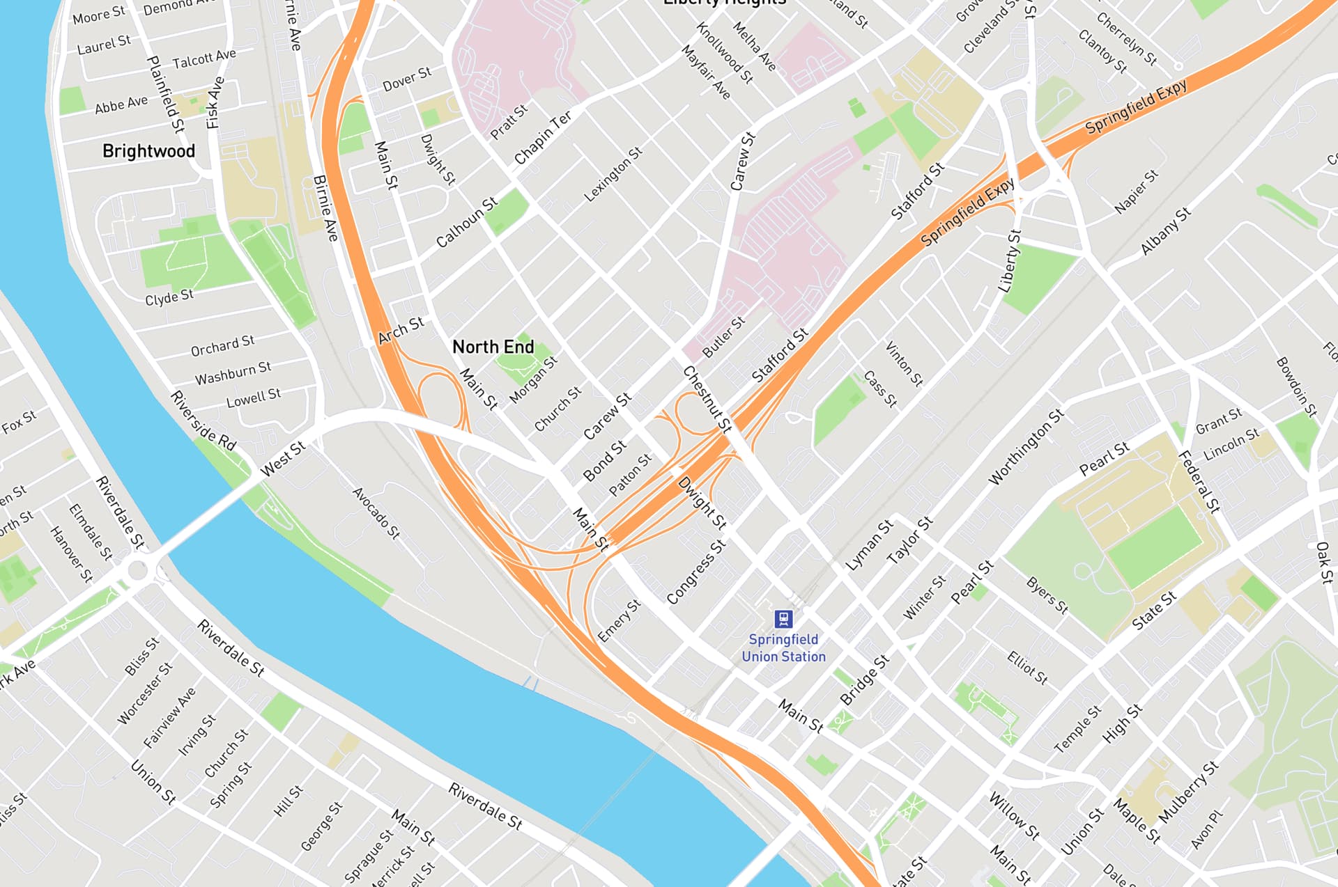
Think the area around Springfield Union Station is why the old one was so much better. Unless I look real close I can only see streets, the lines for them are wider and so look whiter.
In the new style there seem a mass extra alleyways (or similar) and the extra streets thinner and (to me at least) duller which is why I asked if they are actually white.
Also prefer the old font. Seems to achieve more in a smaller font and then just displays a lot more street names at this level. If a line has a street name on it, it is obvious you need to run it. Without a name is it missing or some alleyway.
Another interesting comparison between old/new is that the old style would hide the service roads while zoomed out, but if you did zoom into the area around Springfield Union Station you’d see all of those roads with great prominence:
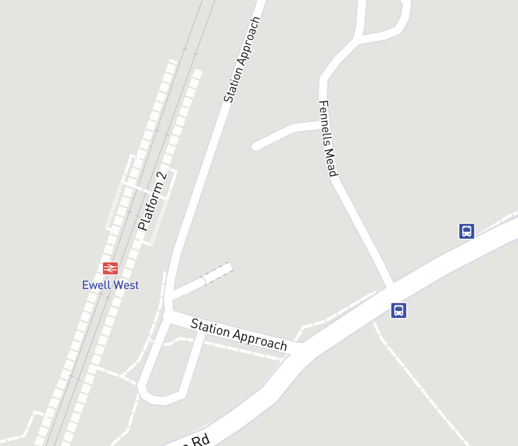
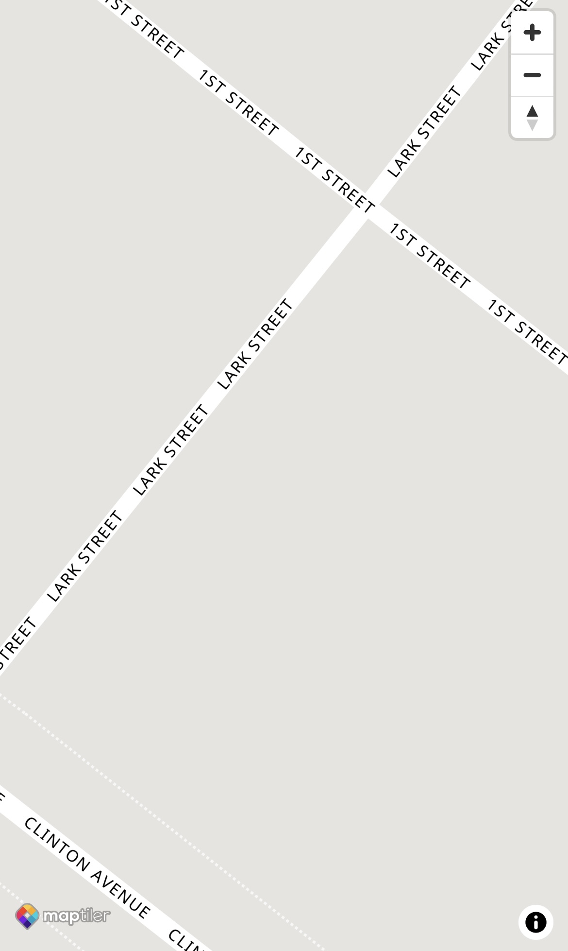
Station Approach is clearly a “normal” street from the main road to the station entrance. But what are these nodes heading off in different directions that appear to be footpaths at first glance?
Street View suggests I actually need to do a lap of the car park!
That other “dotted” road seems to Fennells Mead Google Maps but the street name is not visible at any level. Worse this road ends with nodes within a school. High chance of being arrested if steamed in there when the school children are there. Be blocked by a locked gate otherwise. Better go and update OSM but, with satellite view, could have at least quickly worked out what was going on without pulling up Street View as well.
Update: They appear as a dotted line (like a footpath) on CS as in OSM they were marked as a Service Road but with a street name so hence nodes. I made the service road inside the school private, removed the street name there and changed the approach to the school as a residential road as does appear to be houses up.
The lap of the station car park perhaps should be parking aisles.
The “street” parallel to the railway line has also be named Station Approach but is actually a long linear car park! Oh well I can do a “stride” up there Satellite view would again have made this at least somewhat clearer.
This is what I see now (assuming it is updated) from a photo taken of my screen. The colors blend in. I need to see the big picture (zoomed out further) because I make long complicated routes to fill in spots, avoid crossing major roads, deal with train tracks, dead ends, etc. Zooming in and out gives me grey on white, the streets load slowly and with delay (and it seem like not the same detail as before) and no satellite. It’s your show, but why keep fixing this mess if you need you won’t use it because this vendor doesn’t offer satellite view?
A big reason we need that satellite view is we cant go to google maps to look at a node. This is the only site that has the nodes so its really hard to figure out. For me a Street might turn to a driveway so if I look at the satellite view I can be like…ok I see this road is all messed up and runs into the barn. Today I had to go to google maps because a road was broken with the political boarder between. Was curious if I could cut over and not need to walk threw almost a half a mile in knee deep snow covered farm field. I couldn’t cut over to the road there was a junkyard.
The new map version also doesn’t incorporate mass transit stops. The NYC Subway & Long Island Railroad (LIRR) stops are gone, which are very helpful to plan how to get to and from my planned routes.
Turns out I used the satellite view more than I thought I did, with it integrated with CS and the use of Node Hunter, especially when OSM updates are needed (road not as long and/or as accessible, without actually seeing it). So yes vote for sat view.
City, aka political boundaries, are also a BIG yes vote.
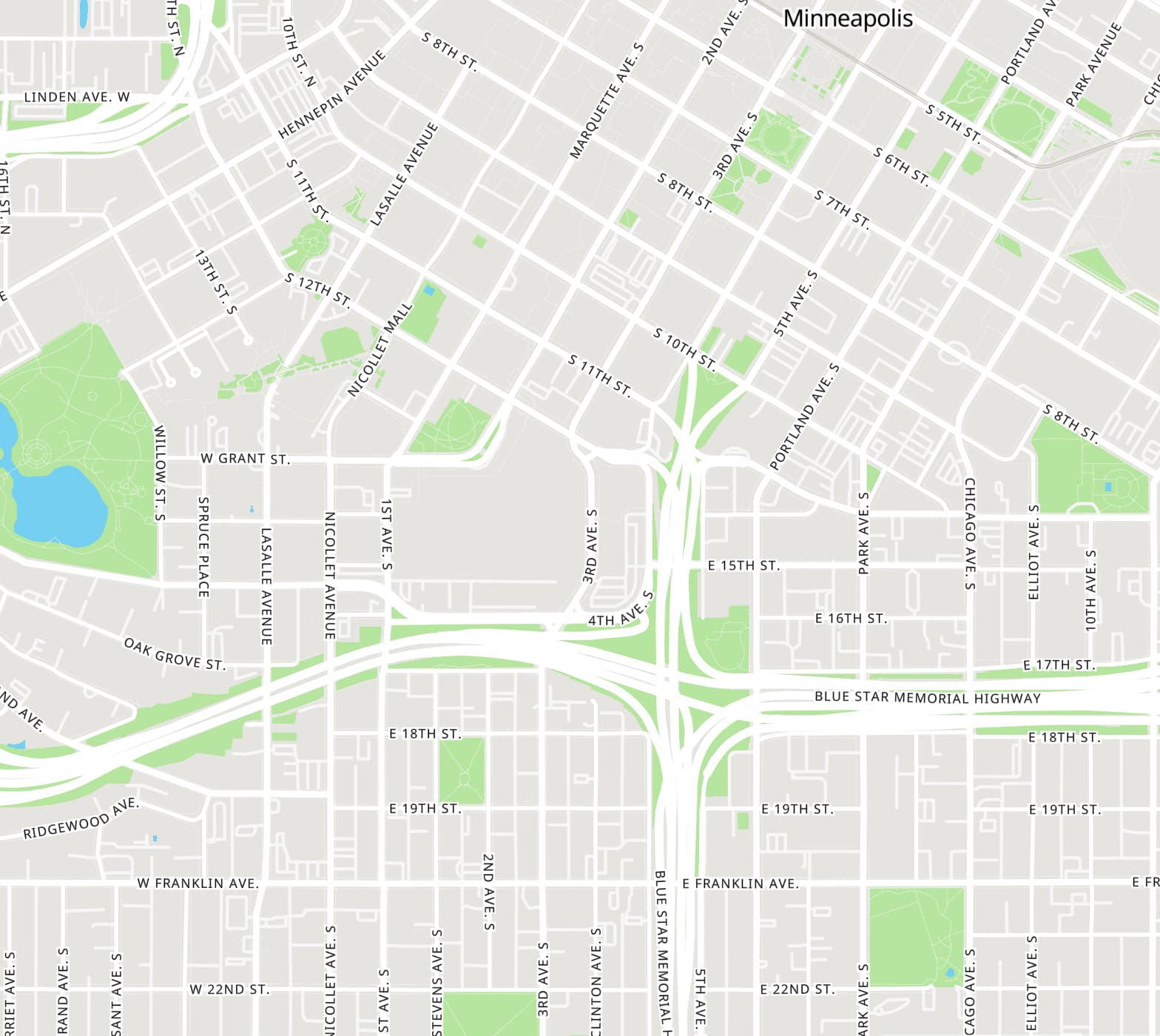
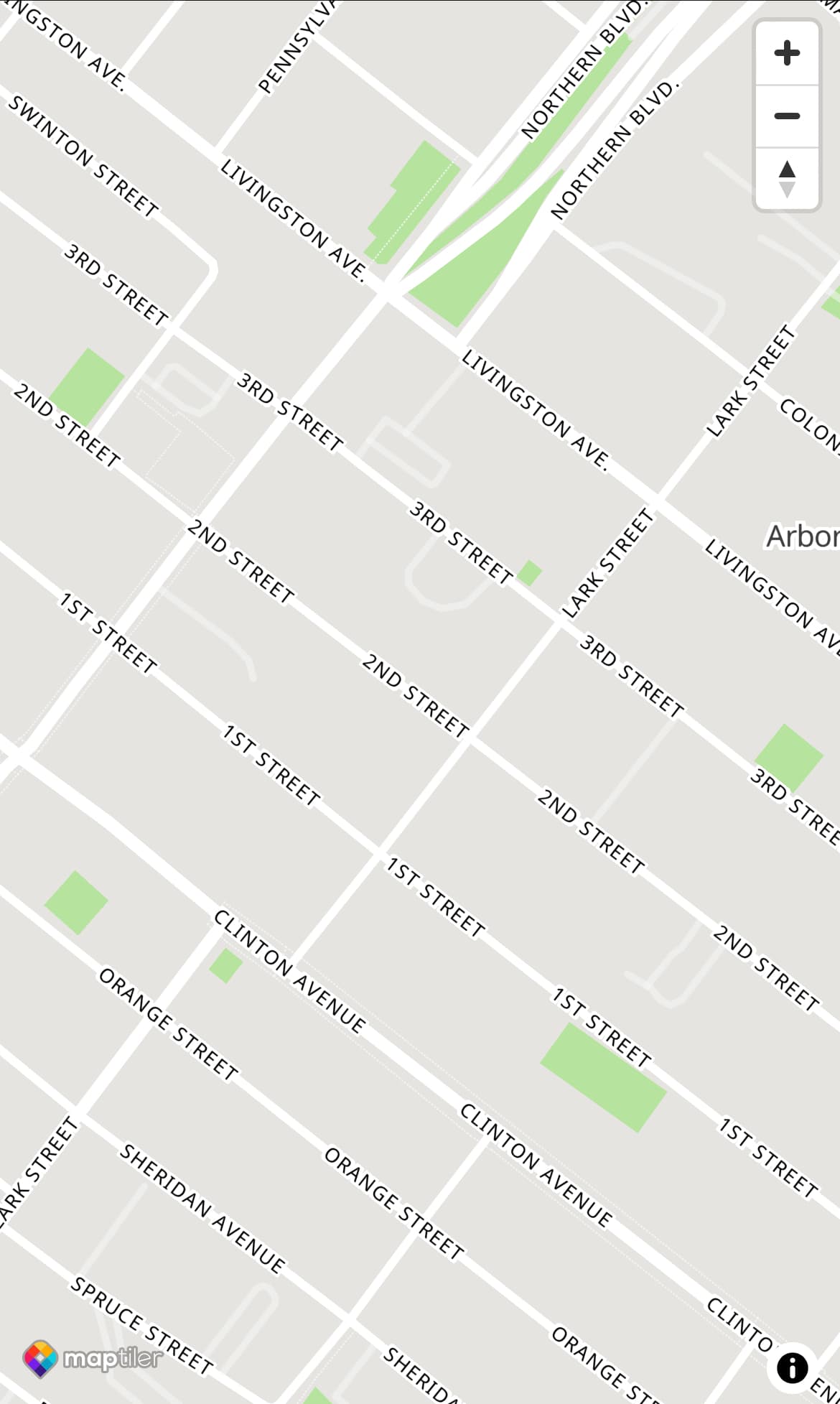
I love the way the Minneapolis screenshot looks. I can tell the different of the Alleys too. And not the overly busy Yellow of highway 94 and 35w in the middle. Those yellow lines really over took the look of cool purple lines.
With the latest iterations the new map style looks decent to me. The close view is fine in my opinion, but when zooming out there is a sudden drop of detail at some point, where only major roads are shown. It would be nice to delay that switch by a few zoom levels as it was before. Sometimes it’s nice to have the big picture! On my device the switch happens when the scale is in the 1km range (is there a way to identify the zoom level?).
Any change takes some getting used to, I think that after a couple of weeks I’d be fine with the new style.
I use the satellite view as well, for the same reasons others have stated, but also because it had much more markup (park names, poi,…) than the map view. Having both available was a good compromise with the “streets only” minimalists.
+1 for borders,
+1 for having transit stops on the map (subway at least)
And yes +1 for railway stations, transit stops, subway/underground/metro stations (whatever they are called where you are!)
In my Ewell West railway station example few messages above handy to see where the station actually is at a glance. I did actually hop on a train to get quickly to a “new” area the other day to do some streets.
Where did satellite view go?? I use that any time I create a new route. A real pain to have to try and use google maps at the same time. Seems like a regression in functionality… I need satellite view back please!
I mention this topic a number of times in this thread.
It’s not available with the provider I initially switched to, and I’m looking into paths forward.
It would be helpful if you could visit this page (EDIT: this example map is no longer needed, the live CityStrides site uses this map now) and check out your city, then leave your feedback here. I think that this map can replace what’s there now, and I’m hopeful that it’ll solve most/all issues. I just don’t have a lot of confidence at this moment.
This test map that you linked is very clean, looks good. An interesting plus was when zoomed way in, the number of labels of a street increase dramatically. This is very helpful when trying to correlate data, so that you don’t need to shift the map as you would where most maps the street label is static.


 This is the version that’s on the site now:
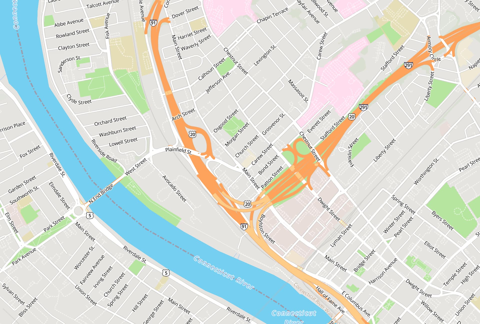


 Satellite view would again have made this at least somewhat clearer.