I don’t think there is a RIGHT answer, but that would work.
The “always on top” and “not purple” seem to be the most important features. As long as it is visible through the (sometimes) purple blob that is the important thing.
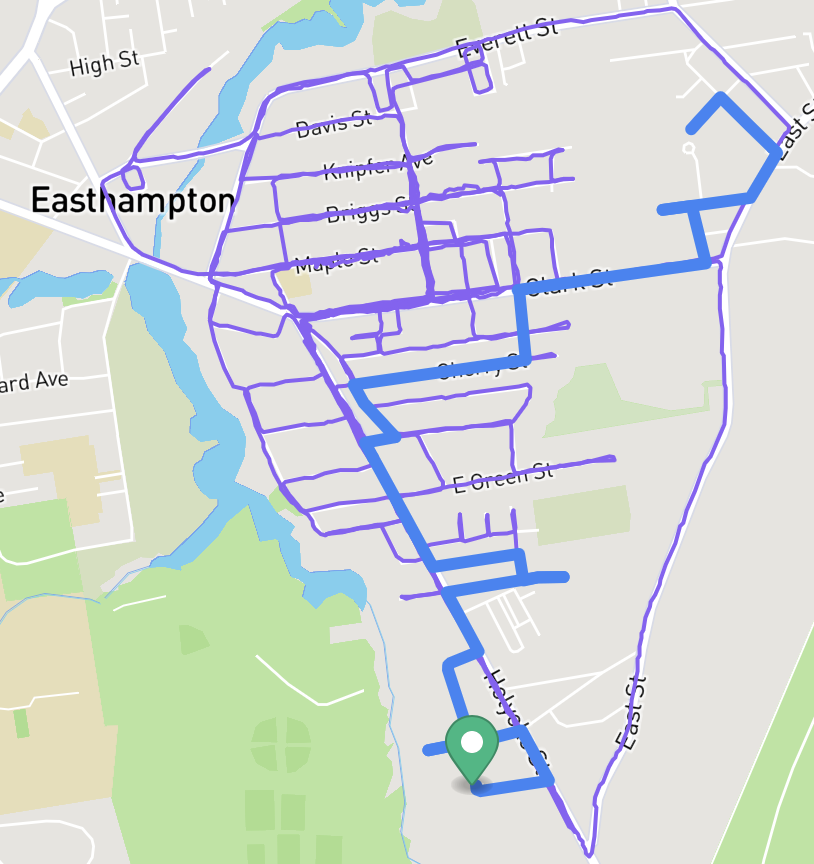
I am not a colorblindness sufferer, so I am not sure what the “accessible” color choices would be.
Good call … I can pass general accessibility requirements by making a minor adjustment to the blue.
I found Sim Daltonism, and found out that in a lot of cases purple → blue.
The thickness & non-jittery qualities of the route line help, but yeesh this is tough work.
I will say that one benefit of the dashed line version is that you could fairly easily tell when your trace back-tracked on itself, then you can decide if that was an error or intended
Is there any reason why a user couldn’t select what colour they wanted the route to be. Either a total colour picker, or even 8 basic colours would be fine. I think blue is still far to close to purple! I do like the dashes though as another distinction.
I like the idea of being able to choose the color, it would also be nice if the dotted line that’s used when creating the route was used to display it as well. Being able to see where it doubles up does help in making the actual route more visible.
I’ll second the “show the route page in the same linestyle as the route creator” request, and raise you one “add a toggle lifemap button the route viewer page” (although NOT showing the lifemap on the route viewer would still be my preferred default)