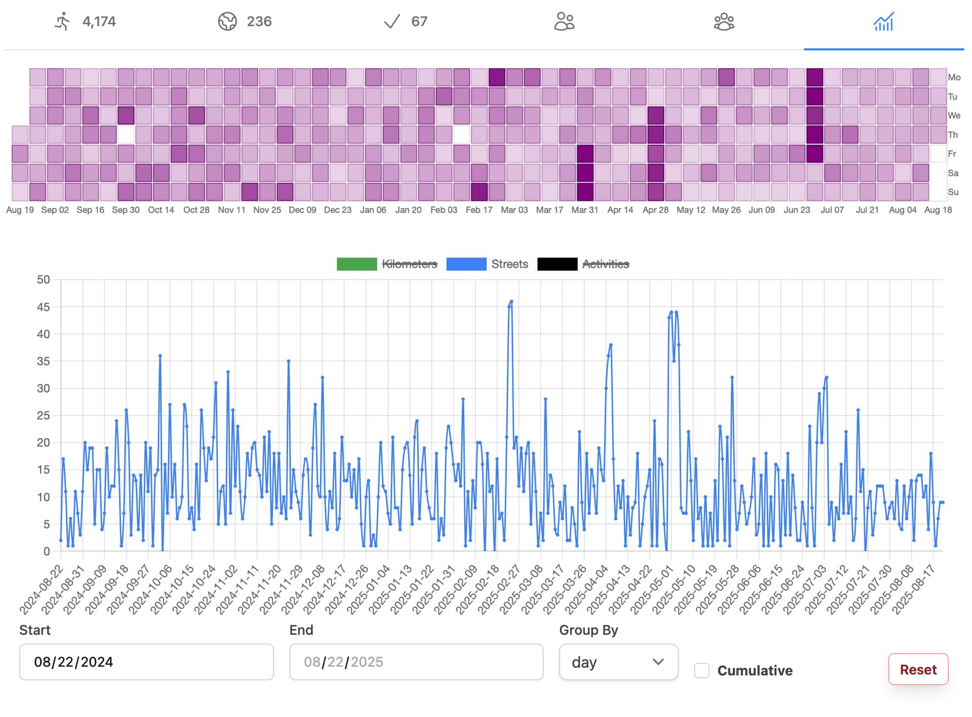
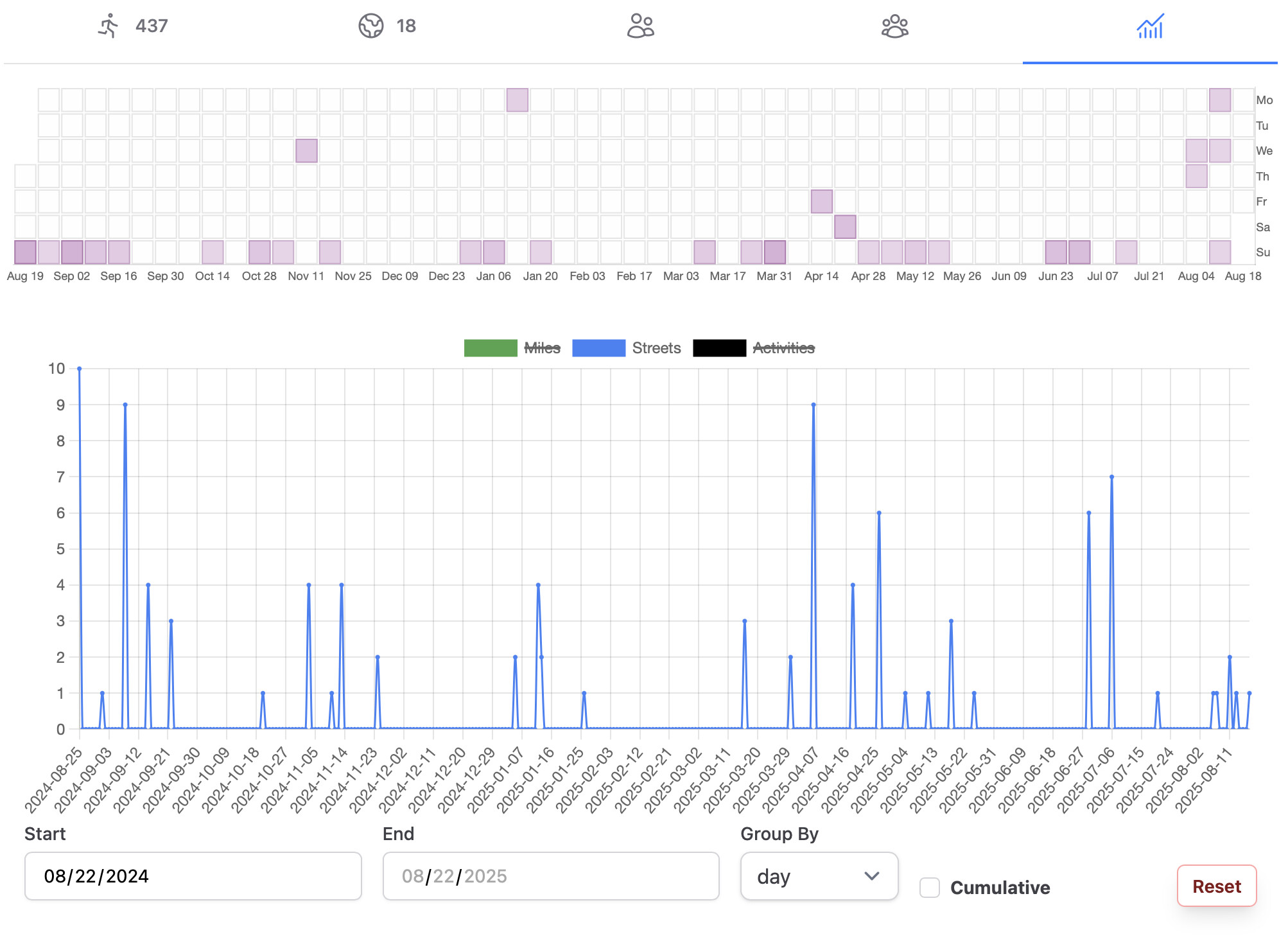
I’ve had this idea of adding a new chart to our profile pages that’s a bit like GitHub’s contribution graph, if you’re familiar with that. I got something working over the past couple days, and I added it above our existing chart. The data goes back one year from the current date, with each day represented as a block that’s darker in color the more streets were completed on that day. Hovering over the block displays its date and the count of completed streets. Oh, and if you have multiple actives in one day that each complete some streets, the sum of completed streets across all the activities is graphed.
This graph is not shown on mobile because of how tiny it gets resized down to.
This screenshot shows my abysmal progress ![]() and for this screenshot I’ve adjusted the bottom chart to display the exact same data, to give another reference of what we’re looking at.
and for this screenshot I’ve adjusted the bottom chart to display the exact same data, to give another reference of what we’re looking at.
It’s definitely more interesting for very active people ![]()