Thanks for this feedback! This was really helpful - I appreciate it so much. I think I’ve fixed up all the issues you reported, but let me know if there’s anything I’ve missed. Maybe someday I’ll be able to afford a designer who can make the site actually look nice. 
Profile picture looks all blurry (it took it from Strava, if that matters)
Yeah, it looks like I was using a smaller Strava image. I just updated the code to use the full profile image instead of the smaller version. That won’t take effect until the next sync, though.
No more sync now button?
The ‘Sync Now’ option is now in the menu. I’ve since updated that, so you’ll find it near the top of the menu - those items are in alphabetical order under the ‘Account’ section.
Activity boxes get crazily stretched out because of streets run in an activity next to it
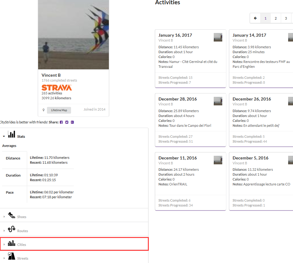
I just updated those so rather than displaying the list of streets, it displays the counts for completed/progressed.
Streets in activity in profile view are aligned at the bottom in the case of previous bullet, looks weird
I think I cleaned up the Streets in activity in profile view, but let me know if there’s still an issue here.
Not a fan of menu opening on hover. I seem to expect to have to click since there is a small delay. Of course at that point the menu has opened and I accidentally click Home instead.
Having the menu open on hover was a bit of a guess for me. I found that requiring a click each time was a bit much, but I might be using it a lot more than others…
To close the menu I then do have to click.
Ugh. I thought it was possible to close the menu with the escape key - I was wrong! I don’t know how I missed that. I just switched the menu over to open-on-click. I’d love to hear everyone’s opinions on this as far as which one is preferred.
I only use citystrides to look at my own heatmap and cities, yet the link to my profile is way down in the menu, even requiring scrolling on my laptop.
I updated the order of the menu to put your most useful links up top.

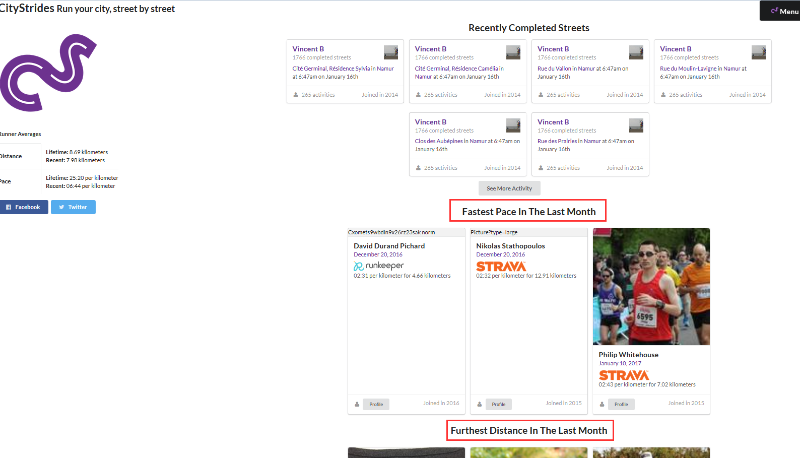
 The code I’ve written for the “Most Completed Streets In The Last Month” list is pretty slow, but it isn’t run every page load so that shouldn’t hurt too much…
