I love the LifeMap that Citystrides offer, it is so cool to see at a glance all the roads I have run.
But I usually, when I go for a run, start tracking from my house, so almost all my runs share a part of the path, and in the LifeMap this results in many blue lines overlapped one to another in the same areas.
I’d also like to have a cleaner map that shows only once each road I have completed or progressed.
I think the result could be nice and maybe also look better when printed?
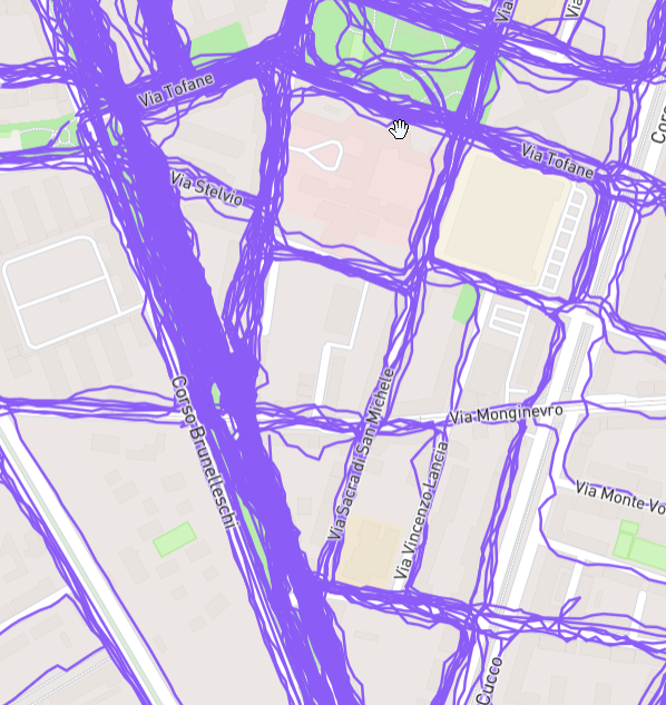
This is a portion of the city map of the city where I live: as you can see there are lots of lines covering the streets, because I run there almost every time.
I’d like to have a map that shows just one line covering the Via Tofane and the other streets, for example.
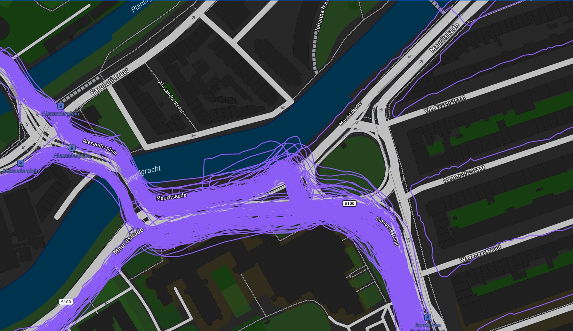
Sorry to revive an old thread, but I can’t help but agree. As someone that used to run the same routes every week and just started with CityStrides, the maps are chaotic:
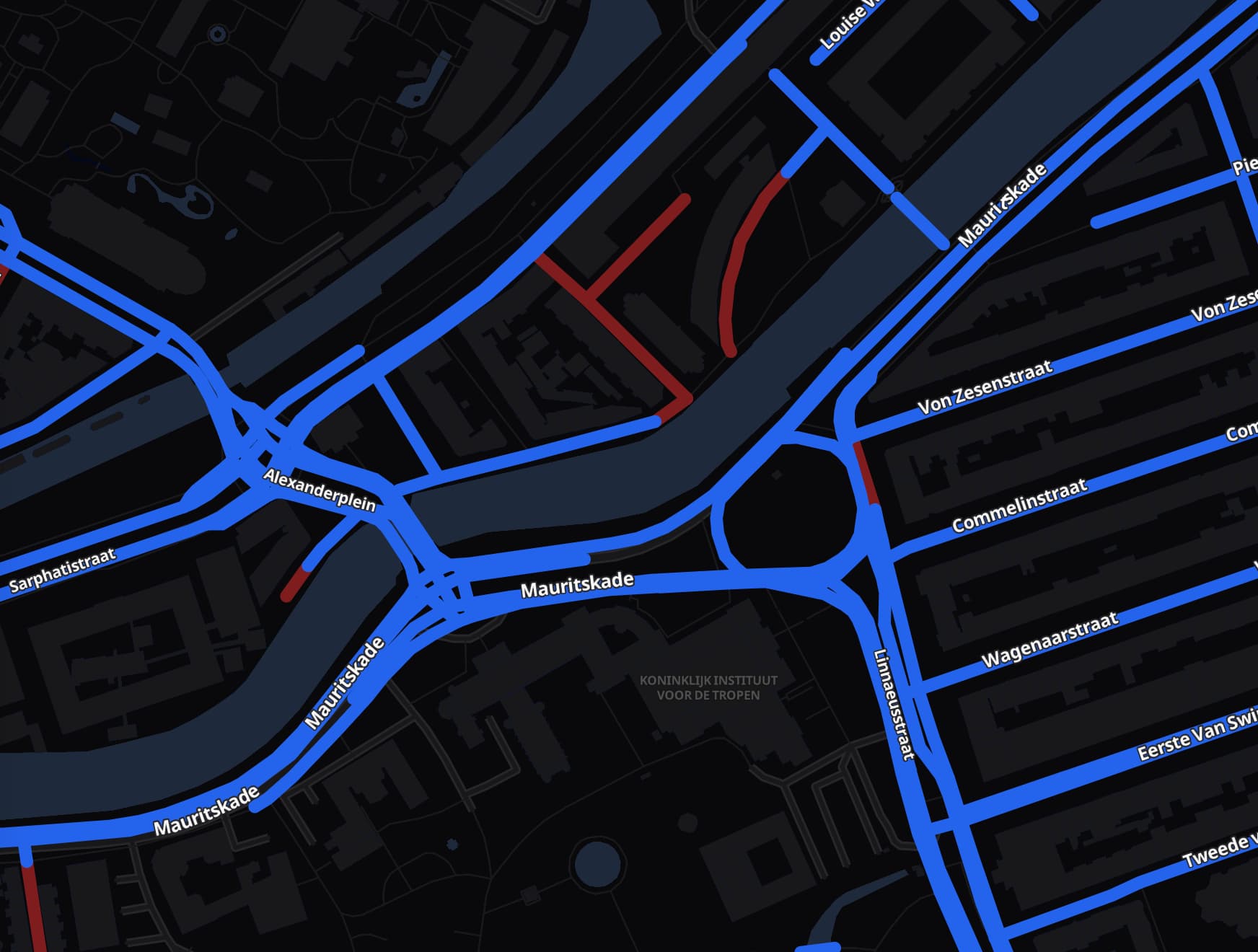
I rather like it as it is now, to be honest. Yes, if I look at Kibworth (where I lived till recently) the browser struggles a bit to render it, as I did a walk around the village every evening for years before I started CityStrides. But I do like the fact, for example, that I can hover the mouse over a line and see the exact date when I did that route.
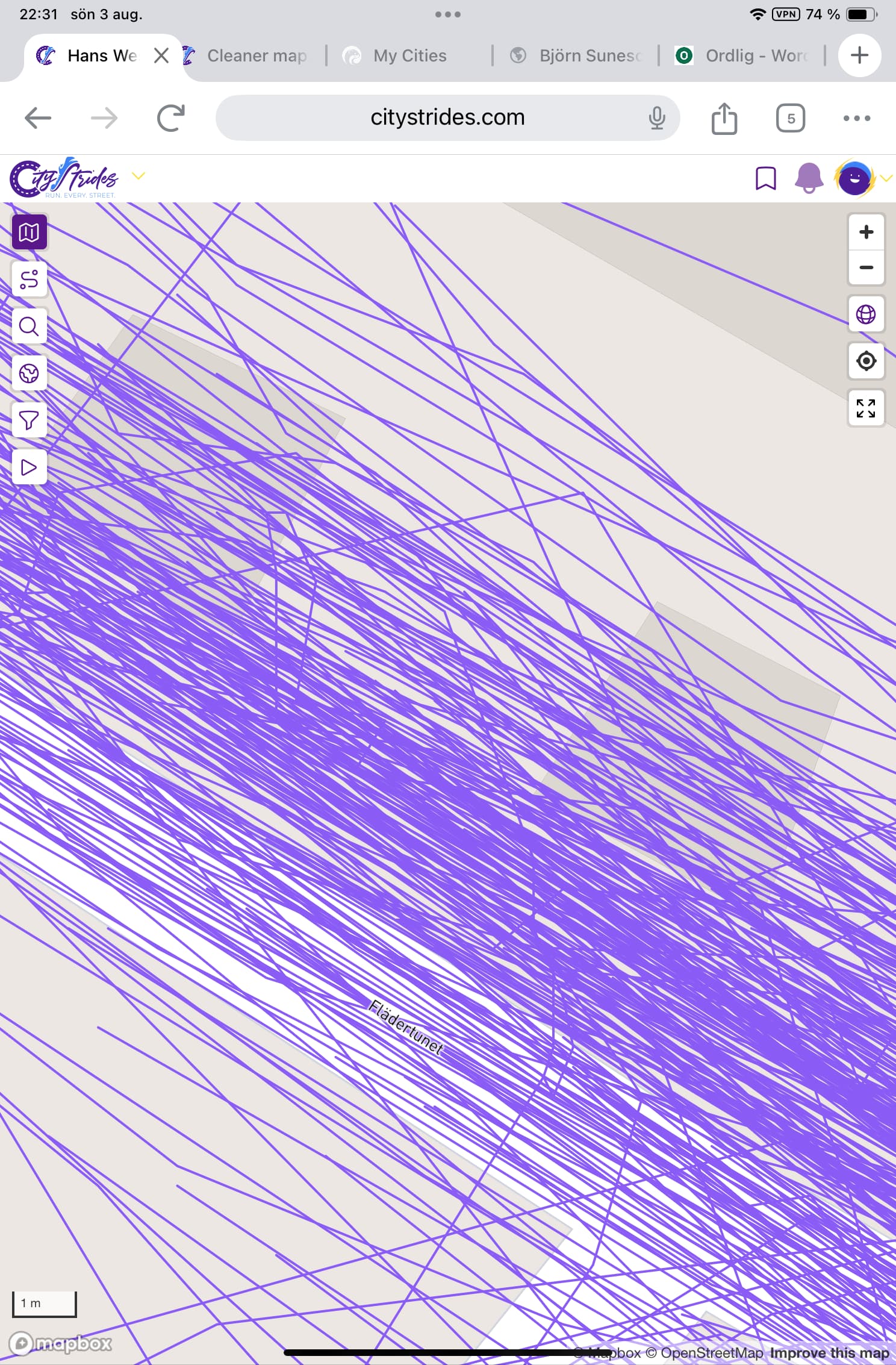
It gives me a perspective of how much I’ve actually run. StreetFerret has a completely different approach, which might be preferable in some situations